Shaped the product experience and brand direction, defining principles, crafting UX, and even designing pages myself to ensure the tool was fast, simple, and built for conversion.
Project
50% faster than Shopify

Challenge
After seven years in big tech, I made the leap to a San Francisco-based one-click checkout startup. Sounds fancy, but I was working remotely from my small apartment in Montreal.
I was brought in to develop proofs-of-concept for new checkout flows and a shopper portal, while also leading the creative visual direction. I helped shape the early product vision, got cross-functional teams aligned, and created work that resonated with stakeholders. Those early concepts became the foundation for future testing and product development.
It was a small team with big ideas, in a market that was kind of falling apart. Risky? Absolutely. But I really connected with the CTO and CEO, and believed in what we were building something special that could genuinely change how people shop. So I jumped in.


Context
When we set out to shape Acquire’s brand identity, we had one clear goal: build a visual language that speaks directly to the bold, independent eCommerce brands shaping the future of online retail.
We knew our audience didn’t want fluff. They want results, measurable, scalable, no-BS results. So we designed a brand that talks like that.
Frictionless. Seamless. Conversion.
These aren’t just buzzwords for us, they’re marching orders. Everything in our system is built to support that mission.
We went with a large, confident sans-serif typeface because it doesn’t whisper. It declares. It says, “Here’s what we do, and here’s how we’re going to help you win.”
The palette? Electric purple, deep black, and clean white. It's not for the faint of heart, and that’s the point. The purple pops with creative energy, the black grounds it with authority, and the white space gives our ideas room to breathe. It’s visually aligned with some of the greats, Webflow, Shopify Plus, Instapage, but we’ve carved out our own lane with a voice that’s bold, modern, and unmistakably Acquire.
This system is more than just a look. It’s a signal. To our users. To their customers. And to the competition.
We're tech-forward, design-savvy, and here to make conversion magic, without the need for code, complexity, or compromise.


Outcome
Let’s be real: small businesses don’t have time, or budget for bloated dev cycles and overpriced landing page tools. So we built something better.
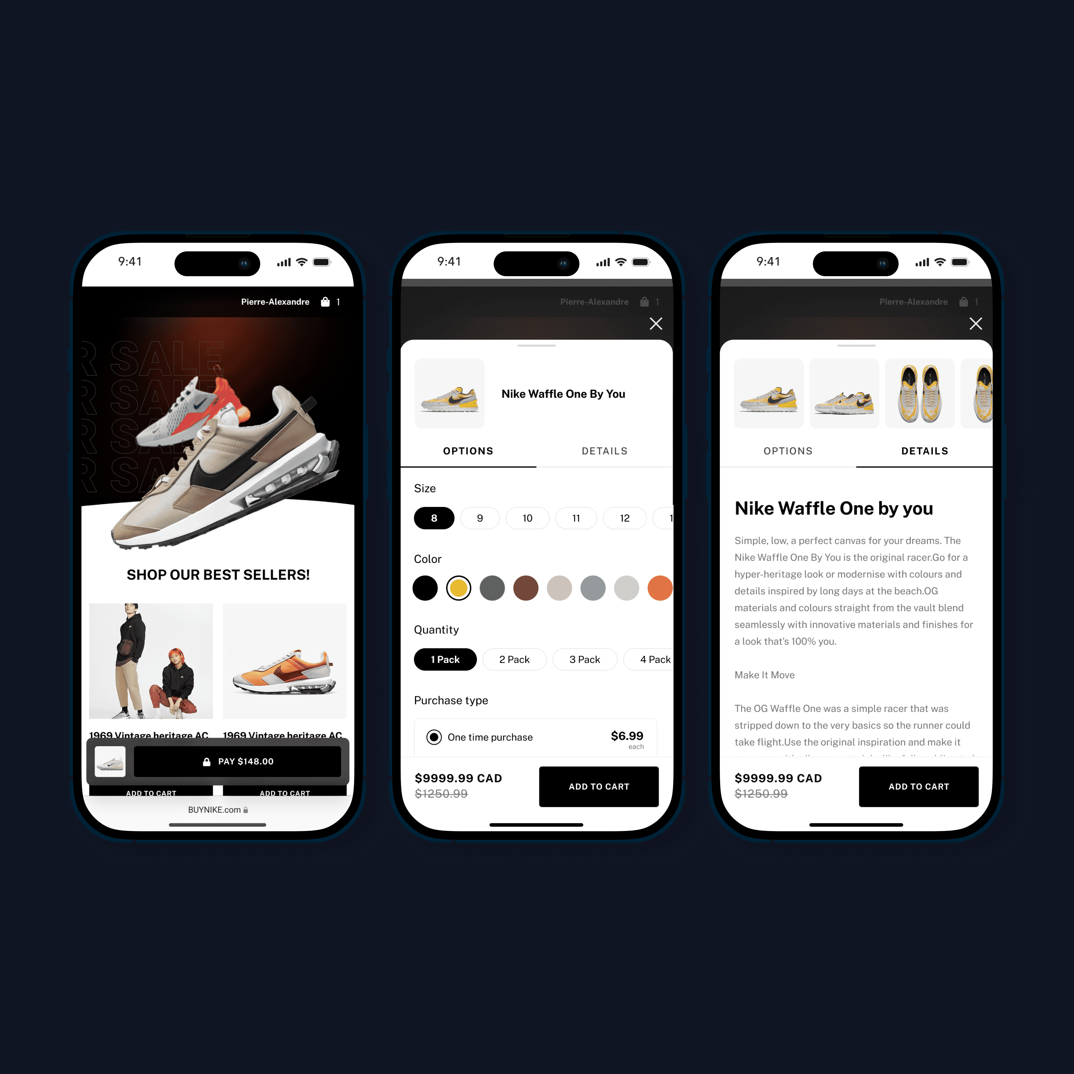
Introducing Acquire’s Conversion-Focused Page Builder, made for business owners who want to launch fast, convert faster, and never touch a line of code.
We designed the builder so you can create high-performing landing pages in minutes, not weeks. (Yes, I even designed a few of those pages myself, because if it’s not simple enough for a designer under deadline, it’s not simple enough.)
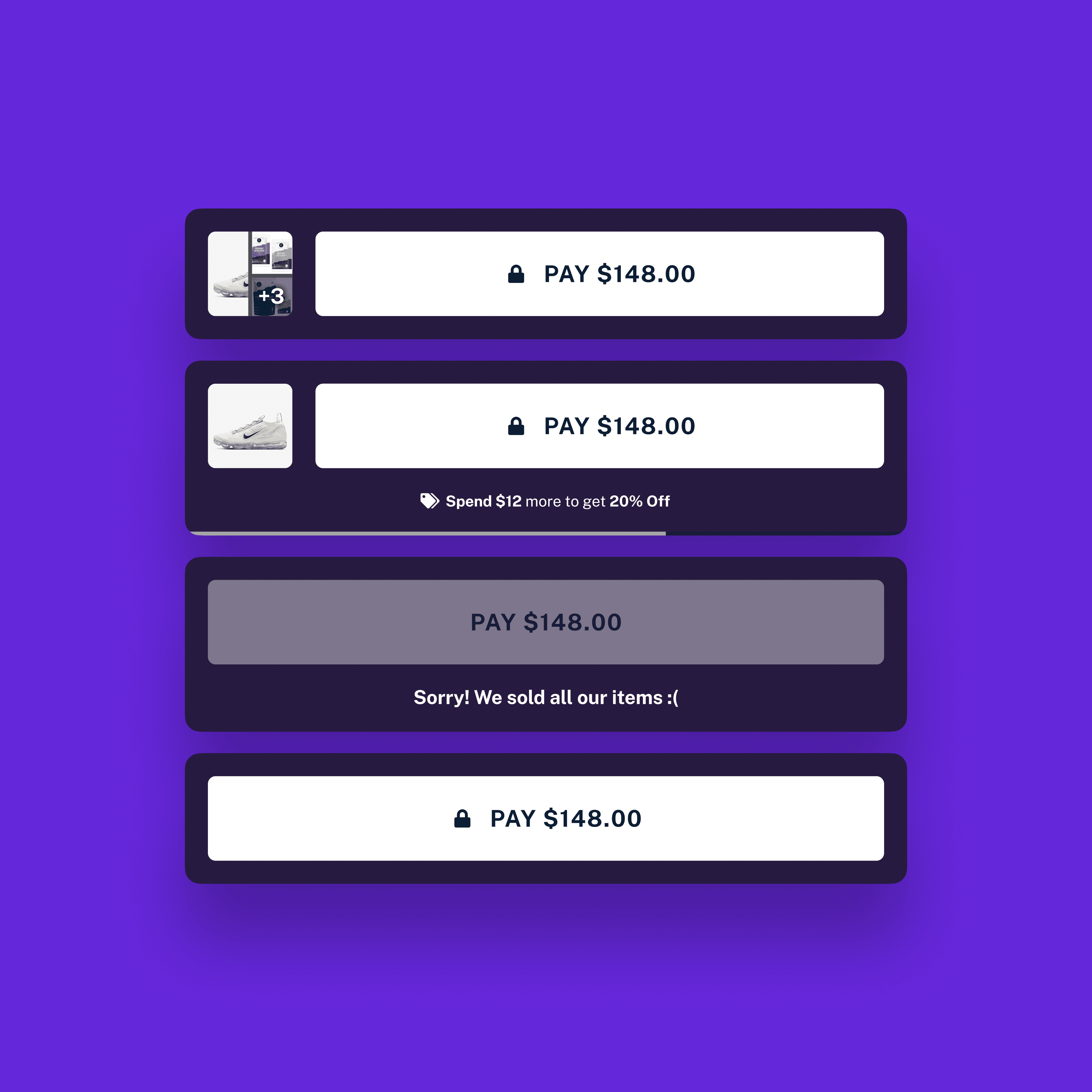
But simplicity doesn’t mean compromise. Every page runs on a zero page-redirection flow and a record-breaking minimum number of clicks to checkout. Translation? Frictionless buying that makes conversions feel inevitable.
50% faster than Shopify. Built for retargeting ROI. Designed to move.
For the Shopper
The experience doesn’t end with a checkout. Acquire’s shopper portal automatically gathers order history, manages subscriptions, and makes post-purchase updates a breeze.
Want to update your shipping address? Done.
Need to switch your payment method? Easy.
Taking a break from a subscription? Tap, pause, breathe.
No logins. No hunting through inboxes. Just a seamless, branded experience that builds loyalty while you sleep.
We didn’t just design a product, we designed a conversion machine that makes life easier for your team and your customers.
Welcome to the faster, simpler, smarter way to sell.